Although a lot of paint colours come and go, nothing has remained as popular as beige. Often maligned as boring or dull, it certainly still is one of those colours people find they can live with long-term… and who wants to paint constantly?
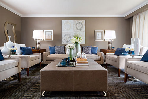
The nature of beige has changed over the last few years as it’s become lighter and slightly more grey in tone but a warm beige will always be tops on my list of go-to colours. So here is a selection of beiges that always do well for me, and which no client ever complains about when applied to their walls. After 20 years in interior design, I have made a personal list of colours that always work and these are five of my favorites. Happy painting!
1. Benjamin Moore — Stone Hearth (CC-490)
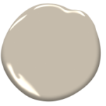 This is absolutely the best transitional colour from a warm beige to a taupe, or a more grey-toned beige (this is essentially what taupe means). This colour looks great with light maple wood or blond wood when you want to update the colours around it. This hue gives the wood a cooler surround which makes it look more sophisticated. Add black and charcoal to this scheme and it completely gives plain light maple a newer, fresher feel. It is also excellent with medium to dark woods as well. It has no pinky tone so it really does mix with today’s decor exceptionally well.
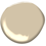
2. Benjamin Moore — Stone House (CC-120)
 This is an excellent warm beige with a very slight yellow/orange undertone. It is an excellent warm neutral with enough chroma to it, to feel as though you have applied paint to the wall but it’s not so heavy as to make a room feel dark. It looks excellent with dark wood floors and white trim. An all-round good choice for the family room, basement, foyer or even bedroom.
3. Farrow & Ball — String No. 8
 This is a colour that many of my clients love. It has no orange or pink undertone in it so if you are sensitive to seeing these colours in beige, stick to this colour. It has a green-grey undertone so it is very neutral overall. It’s a medium to light colour on the wall and with it’s toned or slightly muted nature it will blend very well with other colours as it becomes the background.
4. Benjamin Moore — Shaker Beige (HC-45)
 A part of the historical collection, this group of colours has been around for at least 40 years when the collection was first released, so it is tried and true. I love the mid-depth of this beige but it is very neutral in tone, meaning it is well balanced between grey, green and yellow. And it doesn’t really change too much in different lighting conditions which makes it a very stable colour for rooms that are used in both day and evening conditions. This is a definite classic.
5. Farrow & Ball — London Stone No. 6

A deep rich beige moving towards a brown-based grey-beige (or taupe), this is a rich colour that will once again, become background, despite its mid-depth of colour. Its grey base helps it to blend into room scapes despite its rich nature, allowing furnishings to take centre stage. A really great background colour with some guts!
Finally, a close option, coming in sixth place, is Benjamin Moore’s Natural Linen (CC-90). This is a lighter beige than the other five on this list but it is great for hallways, basements, bedrooms or any place you want a light neutral that is darker than white but which does not turn pink or peach on the wall once applied. Definitely worth a look too!