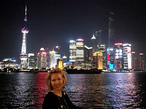
Shanghai is an amazing city! With almost 23 million residents it has grown as a modern beacon on the shores of the Yangtze River. The new financial district, built in less than 20 years shows China’s determination to become an ode to western culture but in a distinctly Chinese manner and process. As noted by past leader Deng Xiaoping, if China is the dragon, then Shanghai is the head and this is why the furniture show is an amazing example of China’s growth and Western reproduction.
The show is only three days and covers more than 15 huge buildings. Each building is connected to the next and the entire site is connected to downtown Shanghai through a subway system that is larger than the subway system in New York or Paris.
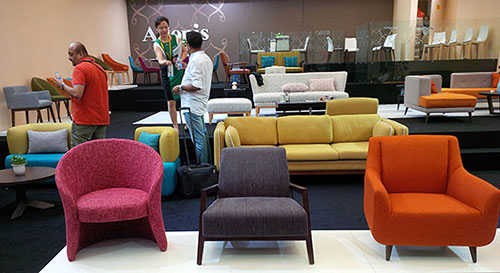
The Shanghai Furniture Show covers upholstery, office, traditional and contemporary furniture, accessories and casegoods. Booths are not minimal like many shows in the west. They are massive and built with full walls and ceilings, lighting, even stairs and second levels.
The trends we noted are our observations of what manufacturers expect to sell worldwide for the next six months.
Linear Looks
The use of thin lines, rods, posts are a new look. Although monolithic shapes still remain, this lighter look is definitely new in contrast to the heavier solid pieces.
Pastels
Although horrifying to people who remember the 1980s, this is not a pleasant thought! Pale pink, gray, blue and green were combined with beige, light woods and charcoal.
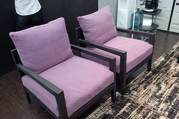
Bright colour
Still trending is the use of bright colour. Turquoise, pink, orange, and some yellow were definitely the strongest colour trends in both upholstery and in casegoods.
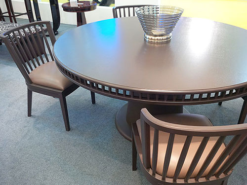
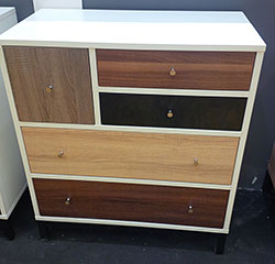
Wood in grey/beige and grey/brown
Chocolate brown has become more grey in tone and less saturated. Lighter woods were everywhere including antique blond as well as a grey/beige tone. These colours are more neutral and less strong within an environment.
Light wood and chrome
The mix of natural looking wood with a weathered finish has been combined with chrome to add glitz to this natural surface. The furniture design that combines these two items is both contemporary in shape as well as traditional. For example, a traditional pedestal on a light wood table would have a chrome pedestal in place of a wood one.
Cleaner wood designs
The idea of blond or light wood has been around a few years but it is taking on a more refined look. Furniture pieces are less bulky and are showing better style and proportion making them more easy to integrate.
Walnut
Walnut furniture as well as shapes reminiscent of the 1960s Scandinavian furniture styles were evident everywhere. The walnut wood colour provides a nice wood grain like blond finishes but it easier to sell into homes that still want the slightly more formal feel that darker wood provides.
 Integrated materials
 Integrated materials
The mix of natural wood with high gloss lacquer is definitely a new look that really is new. Versions of this were produced in the 1960s but with colours, not natural wood. So this is a distinct and new variation — a crossover piece that allows for the return of high glass lacquer mixed with the softness of wood.
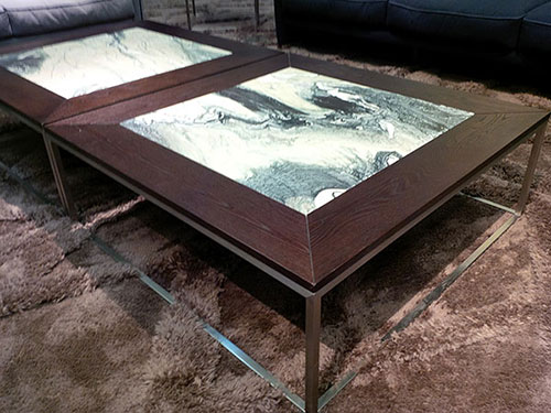
Large coffee tables
With the slow creep of the family room as the dominant room in the North American homes, furniture has had to change to accommodate it. With this comes the large centre table. Some tables were two large rectangles seamlessly pushed together to create one massive table, while others offered a table and ottoman combination. This centre piece has become just that, an important functional and focal point of a room.
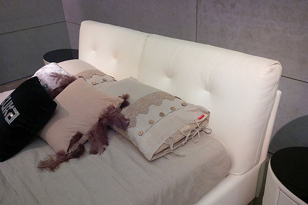
Continuation of soft headboards
This is a trend that has been on going but worth noting is that the current headboard selections here have been largely traditional with slight contemporary additions. It was interesting to see much more modern upholstery applied to this category with French seams, long horizontal tufts, no studs and slight modern curves to the sides of a headboard.
Geometric shapes
The idea of linear and geometric patterns were dominant both in Furniture design as well as upholstery. And the look of geometry did not have to be symmetrical. There was as much asymmetrical design as measured repeats. This asymmetrical look creates a very dynamic and modern feel to a space.
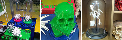
“Curiosities” as accessories
Accessories were modelled after what I would call Sherlock Holmes and his “Curiosities” meaning that there were a lot of skulls, skeletons, shells etc, all under glass domes as though being preserved for later experiment. Incidentally, the term curio cabinet comes from the word curiosity which was what the Victorians did with items they wanted save and show off. They displayed them in a “curiosity cabinet”.
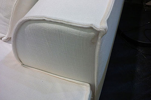
The flanged edge
This is a sewn edge that has replaced piping along the seam of causal sofas. It is a new shabby chic look that emphasises not only the seam but the lines of the furniture piece. It is an overstated look that makes a piece look very casual.
What wasn’t trending?
It’s important to note what wasn’t trending. The traditional dining set simply doesn’t exist any more. Matching pieces is very limited and coordination of furniture is to look more skilled than “matchy-matchy” sets. Also, complicated traditional pieces were no where to be seen, even in the traditional buildings. There, the closest you got to traditional was a Louis XIV Chair but in a light wood and pastel fabric.
Dark wood was not prevalent everywhere unless it was modified in colour to be slightly more neutral. There were no floral patterns or anything even abstracted to look floral, anywhere at the show. No water colo ur flowers prints, nothing. There were animal prints still but mostly in variations of geometric shapes and solids.