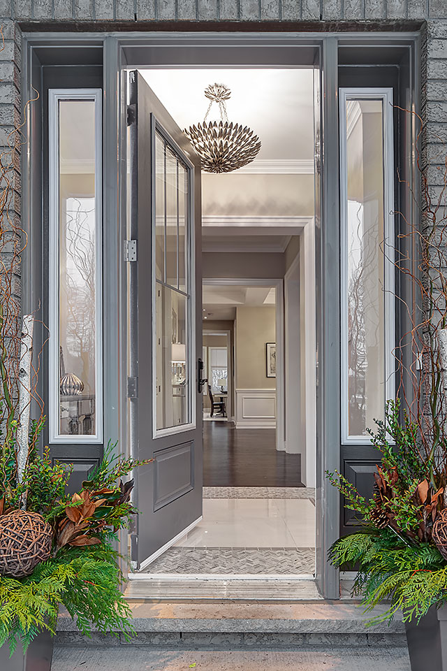
No matter how your exterior facade is designed, the front door is always the most important element as it allows visitors and passers-by to generally grasp the shape and layout of the exterior of your house and, of course, to let them know where to enter.
There has been a long history associated with door colours and their meanings, much of which we ignore today but that doesn’t mean there aren’t great decorative options for the front entry.
And remember, the front door colour can have an impact on the bottom line when it’s time to sell your house so choose with enthusiasm but not without thought!
Here are my top five paint colours:
Pitch Black No. 256

This is classic black which works well with taupe, beige, cream, white, grey, yellow, olive green or any exterior material that needs a strong focal point. Black is good for adding “weight” to a facade, making it appear more solid to viewers. However, black can be a poor choice if your entryway is deeply shadowed, covered or partially hidden as it creates a “black hole” from the street and appears unwelcoming rather than classic. Pitch Black No. 256 (Farrow & Ball).
Hale Navy HC-154

An ‘almost black’ navy blue, this deep and rich hue will add a touch of colour without being garish or too colourful. Like black, it is classic and complements light surrounding substrates and has always been a colour associated to authority and trust. It is an excellent choice for orange, salmon or yellow-bricked homes as it adds a touch more brightness than black. Hale Navy HC-154 (Benjamin Moore).
Willow CC-542

This is a very interesting colour as it’s not brown, nor is it charcoal, but rather a mix of the two. I like to call it “dark greige” to represent that it is a mix of brown and grey together. This is a wonderful colour choice if you don’t want the heaviness of black, and a chocolate brown may look too 70s; this is a strong but subdued neutral for the front of the house.
It will work well with any stucco or brick colour and is especially good for houses with dull beige fronts and lacking a focal point. Willow CC-542 (Benjamin Moore).
Arroyo Red 2085-10

This is a deep delicious red that isn’t pink in its undertone, nor is it burgundy. It’s a mix of red, settled down by brown but it hasn’t lost its red character which can happen when red is toned by brown/orange. Outside in the sunlight, it is lush and stately. It is not a bright red, but a classier version of it.
I love this colour with all brick colours and most stucco colours (although I’m not fond of yellow or orange stucco with a red front door). This is a lovely front door colour that complements the classic combo of black, white or grey exterior materials, with this version of red giving it a regal lift. Arroyo Red 2085-10 (Benjamin Moore).
Incarnadine No. 248

The definitive front door colour — strong red! If you want a bright red that isn’t pink or cherry, then this is the one. It is a beautiful saturated colour, adding personality wherever it is used. Red doors have always had the association with fashion, good fortune and strong energy and that still applies today. Red is difficult to select for exteriors as it will appear more pink when applied to a larger surface, but this is an outstanding colour if you want to stand out in your neighbourhood (and not look pink!). Incarnadine No. 248 (Farrow & Ball).
This, and all the colours listed previously, tend to reflect the impression of stability, value, strength and stateliness. There are certainly other options possible but these choices remain classic and current.